Exploring the Vibrant World of Colour - Saturation
Introduction:
Colour is a fundamental aspect of our visual experience, influencing our emotions, perceptions, and even our choices. One key element that defines the intensity and vividness of colours is saturation. In this journey through the vibrant world of colour, let's delve first into the concept of saturation and its connection to the art of dyeing yarn.
Understanding Saturation:
Saturation refers to the intensity or purity of a colour. A highly saturated colour appears vivid, bold and possibly dark, while a desaturated one (or less saturated as I prefer to think of it) tends to be more muted or pastel. Think of a lush, deep red compared to a more faded paler version of the same hue – the former is highly saturated, while the latter has lower saturation.
Dyed Yarn and Saturation:
The world of textiles and fibres offers a fascinating canvas for exploring colour saturation. Dyed yarn, in particular, is a perfect example of how artisans and designers play with saturation to create beautiful visual effects in both yarns and garments.
There are a myriad of ways to produce a "fade". You can go from a deep colour to a light colour or, you can go from a red to say a blue (this is changing the hue values - we'll talk more about this later when we talk about the colour wheel.) You can also do a combination of both of these changing both the hue values and the saturation.
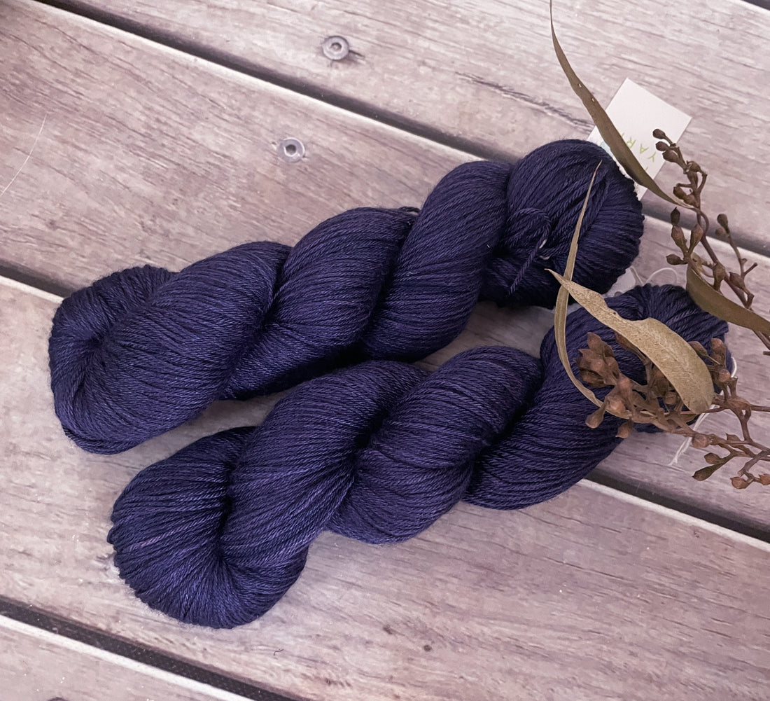
Since I concentrate on a colour a month and January's colour is Purple we'll start by creating a fade varying the saturation levels of the gorgeous Percy's Purple ... one of my new colours for the beginning of the year, Percy's purple is a deep purple/navy cross... and I will change the depth of the colour by half each time over 5 skeins until I reach the palest version of the colour. Stay tuned!